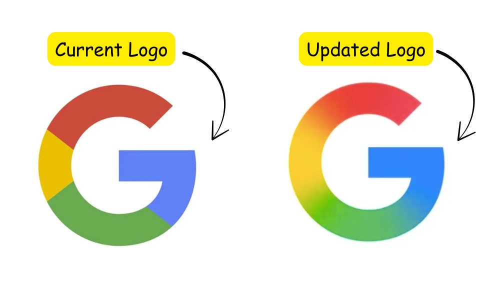
Google Updates Its “G” Logo with a Fresh Look
Google has updated its "G" logo with a sleek new gradient design. Learn why this change matters and what it means for Google’s future.
Google’s iconic “G” logo just got a fresh update after nearly a decade of the same design. The new logo now features a smooth gradient of red, yellow, green, and blue, replacing the solid colours it used before. It’s a simple change that makes the logo look more modern and aligned with today’s design trends.

Why is Google Changing its Logo?
This update is more than just about freshening up the look. The new gradient design matches Google’s Gemini logo, helping create a more unified brand identity across its services. It’s a reflection of the design world moving toward softer, blended colors, and Google is keeping up with these trends to ensure its brand stays relevant.
If you’re using the Google app on an iPhone or a Pixel device, you may have already spotted the new logo. It’s not everywhere just yet, though — Android users and those accessing Google on the web will still see the old design for now.
What’s Next with the Google Logo Design?
This change might be just the start. Google may be preparing for more updates across its platforms, including a new design language called Material 3. This could make the overall Google experience more user-friendly and visually appealing, continuing the company’s push for a modern, consistent look across its ecosystem.
In short, the new “G” logo keeps Google’s identity fresh, modern, and in tune with current design trends, all while keeping that familiar “G” we know and love. As brands like Google evolve their visual identities, businesses and creators can also experiment with modern aesthetics using tools that make it simple to design logos that feel current and impactful.
Get the latest marketing news and trends
Delivered straight to your inbox.
Thank you for subscribing!
Stay tuned for the latest updates.
Meta will begin charging advertisers additional fees for ads delivered in six...
If you run a small business in India — a café in...
Google Labs has introduced Photoshoot, a new feature inside its experimental AI...
If you’ve been running Meta ads for any length of time, you...


