


Social media platforms keep changing their layouts. One update, and suddenly your cover photo looks cropped, blurry, or completely broken.
That’s why image dimensions matter more than most marketers realize.
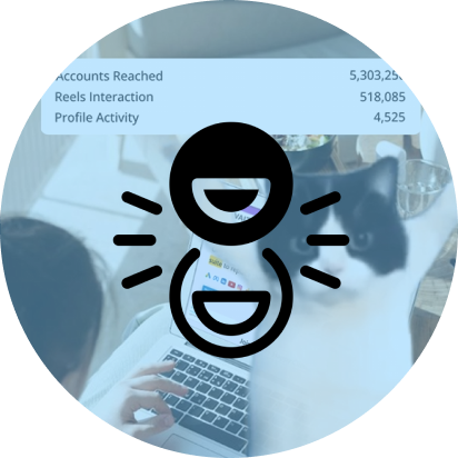
As platforms evolve alongside user behavior highlighted in broader shifts across social media platforms, visual formatting has become a core part of content strategy—not just design.
This guide gives you the latest social media image sizes for 2026, along with aspect ratios, mobile optimization tips, and common design mistakes to avoid.
| Platform | Post Size | Story/Reel Size | Cover/Banner Size | Profile Image |
|---|---|---|---|---|
| 1080 x 1350 px | 1080 x 1920 px | N/A | 320 x 320 px | |
| 1200 x 630 px | 1080 x 1920 px | 851 x 315 px | 196 x 196 px | |
| 1200 x 627 px | N/A | 1584 x 396 px | 400 x 400 px | |
| X (Twitter) | 1600 x 900 px | N/A | 1500 x 500 px | 400 x 400 px |
| YouTube | 1280 x 720 px | 1080 x 1920 px | 2560 x 1440 px | 800 x 800 px |
Most platforms now prioritize vertical formats, a trend strongly shaped by evolving social media trends and mobile-first consumption patterns.
If you still design square-only graphics, you’re probably losing visibility.
Wrong image dimensions don’t just look messy. They hurt performance.
Platforms automatically crop, compress, and resize uploads. If your design isn’t optimized, important text gets cut off. Logos disappear. CTA buttons become unreadable.
Here’s what bad sizing usually causes:
Instagram, Facebook, and LinkedIn all prioritize content that fits their native feed layouts.
A properly sized vertical post occupies more screen space. More screen space usually means more attention.
Simple, but powerful.
Over 80% of social media traffic now comes from mobile devices.
That means desktop-perfect banners often break on phones.
The solution:
Mobile-first design thinking aligns closely with insights found in modern social media marketing tools that prioritize responsive content optimization.
People judge visual quality fast.
A blurry YouTube thumbnail or stretched LinkedIn banner instantly makes a brand look outdated. Especially in B2B.
Your design quality becomes your credibility.
Instagram is still the most visual-first platform. Small sizing mistakes stand out immediately.
Here are the latest Instagram image dimensions for 2026.
Square Post
Portrait Post
Landscape Post
Portrait posts usually perform best because they take up more vertical feed space.
That means users spend more time looking at them while scrolling.
Stories and Reels are fully vertical.
Avoid placing:
Instagram UI elements often cover those areas.
Keep logos centered.
Tiny text usually becomes unreadable after cropping.
For most brands:
Vertical formats dominate because they maximize mobile screen usage.
Key Takeaway: 1080px width is now the universal standard for Instagram content.
Anything smaller risks compression and blur.
Facebook supports more content formats than most platforms. That also makes sizing more confusing.
Here are the latest Facebook dimensions you should use.
Desktop and mobile crops differ slightly.
Keep important elements centered.
For carousel and feed creatives:
Many users search Facebook dimensions in centimeters for print-based workflows.
Approximate conversion at 96 DPI:
| Pixels | Approx CM |
|---|---|
| 1200 x 630 px | 31.75 x 16.67 cm |
| 851 x 315 px | 22.52 x 8.33 cm |
| 1080 x 1080 px | 28.57 x 28.57 cm |
Feed Ads
Link Ads
Story Ads
Facebook aggressively compresses low-quality uploads.
Use:
Larger files look sharper across devices.
For optimization workflows, marketers often rely on free Facebook audit tools.
LinkedIn visuals work differently from Instagram.
Professional audiences expect cleaner layouts, sharper typography, and minimal clutter.
This is one of the most searched LinkedIn dimensions.
Avoid placing text near profile image overlap zones on the left side.
Use:
Especially for founders and executives.
This size works best for:
Square Post
Landscape Post
Vertical Post
Vertical posts increasingly perform better because LinkedIn’s mobile usage keeps growing.
Most LinkedIn users scroll quickly during work hours.
Your design needs to communicate instantly.
X still favors horizontal visuals more than Instagram or TikTok.
But mobile optimization matters here too.
This works best for:
The profile photo overlaps part of the banner.
Keep important visuals toward the center-right area.
| Content Type | Aspect Ratio |
|---|---|
| Single Image | 16:9 |
| Square Graphic | 1:1 |
| Mobile-Friendly Visual | 4:5 |
Most Twitter image issues happen because:
Simple fix:
Design with safe padding.
YouTube visuals directly affect click-through rates.
Especially thumbnails.
This is the recommended YouTube channel background image size.
Everything important should stay inside the safe zone.
Same as banner size:
But only the center section appears across all devices consistently.
Good thumbnails usually include:
YouTube crops banners differently on:
That’s why the center safe zone matters so much.
Without it, your text may disappear entirely.
Different formats work better for different content types.
| Format | Best For | Pros | Cons |
|---|---|---|---|
| JPG | Photos | Small file size | Lower quality after compression |
| PNG | Graphics/text | Sharp quality | Larger files |
| WEBP | Modern web images | High quality + small size | Limited older support |
| GIF | Animations | Attention-grabbing | Lower resolution |
For most marketers:
Simple rule.
Canva includes preset dimensions for:
Fast and beginner-friendly.
Photoshop gives you:
Best for advanced teams.
AI tools can now automatically:
Useful if you publish high content volumes.
Blurry creatives immediately reduce trust.
Always export at platform-recommended dimensions.
Most people preview designs on desktop.
Big mistake.
Check every visual on mobile before publishing.
Platforms compress text-heavy graphics poorly.
Keep messaging short.
Stretching images destroys quality.
Use native dimensions instead.
Tiny file sizes often create visible artifacts.
Balance quality and compression carefully.
In 2026, social media image sizing is no longer just a design task—it’s a performance strategy.
If your visuals aren’t optimized for each platform’s native format, you’re losing reach before your content even gets seen.
There isn’t one universal size. But 1080px width works best for most platforms because it balances quality and file size.
The best Instagram post size is:
This format performs well on mobile feeds.
The recommended LinkedIn cover image size is:
Facebook cover photos should be:
The ideal YouTube banner size is:
Arushi is a proficient SEO and ASO specialist with a 5-year track record working for B2B and B2C organizations. Currently, she is heading SEO strategy for Vaizle and helping businesses improve their online presence. A mountain girl at heart, she likes to recharge her creative abilities by taking long walks and listening to podcasts.
Copyright @VAIZLE 2026