


Every Facebook ad consists of 5 core components: Primary Text (125 characters visible), Creative (1080x1080px minimum), Headline (40-character max), Description (30 characters), and CTA button. In 2026, creative accounts for 60-80% of ad performance, with primary text second most impactful. Understanding how these elements work together determines whether your ad costs $2 or $20 per conversion.
Your competitor’s ad gets 3.2% CTR. Yours gets 0.8%. Same audience, same offer.
What’s different? It’s not strategy. It’s Facebook ad anatomy.
Most marketers treat Facebook ads like a creative project. But that’s not always the right approach. Instead, you need to understand the technicalities & components behind a successful ad. Each component has technical specs, performance impact hierarchy, and testing methodology. Get one element wrong and your CPM doubles.
This guide breaks down exactly what each ad component does, how much it impacts performance (backed by data), and how to optimize it for 2025’s creative-first algorithm. Written for performance marketers who care about metrics, not theory.
Pull up any Facebook ad right now. You’ll see these 5 elements, in this order:
These aren’t suggestions. Every Facebook ad has exactly these 5 components.
The only question is whether you’re optimizing for all of them or not.
Placement also matters. Feed ads show all five components. Stories show creative, primary text snippet, and CTA. Reels prioritize creative and CTA. Same ad, different visibility rules.
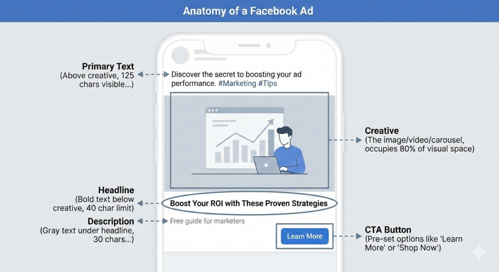
Primary text is the caption above your creative in your Facebook ad. It is the actual copy people read first.
Here’s the constraint: 125 characters show before “…See More” on mobile. Full text can be 475 characters, but most users never expand it.
After creative, this is your highest-leverage element. It’s the only place you can tell a story.
Performance reality: Front-load value in first 125 characters. Analysis shows 80% of users never click “See More.” If your hook is buried at character 150, nobody reads it.
Since number of characters is limited, you should always lead with outcome, not setup. Here’s an example to understand:
Bad: “Are you struggling with low engagement rates?”
Good: “Cut ad costs 40% with this targeting adjustment.”
The first wastes 45 characters asking an obvious question. The second promises a specific result immediately.
Next, don’t forget to use line breaks. Dense paragraphs look very cluttered on mobile. Break every 2-3 lines maximum. White space creates visual breathing room that keeps people reading.
Test question versus statement opens. Questions work for problem-aware audiences (“Tired of wasting ad budget?”). Statements work for cold traffic (“Fashion brands average 1.1% engagement”).
Include social proof early. Numbers, customer counts, specific results. “12,000+ brands use this” beats “Many companies love our product.”
Match primary text tone to creative. If your video is casual and user-generated, corporate copy feels disconnected. If your image is polished product photography, casual copy seems unprofessional. Consistency wins.
Pro Tip: Meta’s 2025 algorithm weights creative over copy, but primary text still sets context. Test: Same creative with 3 different primary text hooks. You’ll see 20-40% CTR variance.
Let’s be clear: Your creative IS your ad. Everything else supports it.
Meta’s Advantage+ and algorithm updates prioritize creative testing over audience targeting. You used to spend hours building custom audiences. Now? The algorithm finds your audience. Your job is to make them stop scrolling.
With Meta’s latest Andromeda update, the platform has clearly asked advertisers to stop niche-targeting and focus on creatives instead. That’s exactly has been Vaizle’s own understanding as well. We conducted 30 ad tests across 9 ad accounts & concluded that simple setups + stronger creatives stabilised faster than “clever” structures.
The shift is massive.
Image Ads
Best for: Direct offers, simple messages, static products Specs: 1080x1080px minimum (1:1), 1200x628px (1.91:1 for Feed)
Still converts well for established brands with strong offers. You’re selling a known product to a warm audience? Image ads work fine. Simple. Fast to produce. Easy to test variations.
Video Ads
Best for: Storytelling, demonstrations, brand building Specs: 1080x1080px (square), 1080x1920px (Stories/Reels), 4:5 ratio for Feed
Higher engagement but requires first 3 seconds to hook. Users scroll fast. Your opening frame determines whether they watch or skip.
Test 15s versus 30s versus 60s. Longer isn’t better. Most winning video ads are under 20 seconds. Exception: Complex products need explanation time.
Carousel Ads
Best for: Multiple products, step-by-step guides, feature showcases Specs: 2-10 cards, 1080x1080px per card
Card 1 gets 80% of swipes. Front-load your strongest visual. Don’t bury your best product on card 4.
Works exceptionally well for e-commerce (showcase product range) and SaaS (explain features sequentially). Weak for simple single-product offers.
| Format | Avg. CTR | Avg. CPC | Best Use Case |
|---|---|---|---|
| Single Image | 1.2% | $1.80 | Static offers, product showcases |
| Video (15s) | 1.8% | $1.45 | Quick demos, testimonials |
| Video (30-60s) | 1.4% | $1.65 | Story-driven, brand building |
| Carousel | 1.5% | $1.55 | Multi-product, features |
| Reels Format | 2.1% | $1.20 | Native content, UGC style |
Source: Vaizle AI analysis of 10,000+ Meta ads, Q4 2024-Q1 2025
Reels format dominates because it’s native to how users consume content. You’re not interrupting their feed. You’re participating in it.
Headline is the bold text below your creative, above description. 40 character limit. 27 show on mobile before truncation.
Function: Headlines bridge what they saw (creative) to what they should do (CTA). Think of it as a mini-value prop, not a repeat of primary text.
Your creative grabbed attention. Your primary text added context. Your headline seals relevance.
You’ve got 40 characters. Use them for outcome, not description. Bad headline: “Check Out Our New Product Line.” Good headline: “Save 40% on Winter Essentials.” The first describes. The second gives a reason to click. Test benefit-driven versus curiosity-driven approaches. Benefit usually wins for direct response. Curiosity works for content plays and lead magnets.
Start with your offer headline (what they get). Test that against a specificity headline (numbers, timeframe). Then try a question headline that addresses their objection.
Example: “Get More Leads” versus “Generate 200+ Leads Monthly” versus “Tired of Empty Pipelines?”
Run each for 48 hours minimum at budget parity. Winner usually emerges by 1,000 impressions. If you don’t see clear differentiation by then, your headlines are too similar or the component isn’t your bottleneck.
Most marketers write headlines like email subject lines. That’s wrong. Email subjects create curiosity. Ad headlines should eliminate it. The creative already got attention. The headline seals the relevance.
Pro Tip: Match headline specificity to creative. If your creative shows a specific product, your headline should name it. If creative is aspirational/lifestyle, headline should be benefit-focused.
Description is the 30-character gray text below your headline. Sounds simple, right?
Here’s the truth: Description doesn’t show on mobile Feed or Stories. Only desktop Feed and some placements. In 2025, with 85% mobile traffic, description impacts maybe 10-15% of your impressions.
So should you skip it? No. Here’s when it matters: Retargeting campaigns where desktop traffic converts better (B2B SaaS especially). Lead gen ads where you want to add urgency. Catalog sales with specific offers. For cold prospecting mobile campaigns? Honestly, your time is better spent testing creative.
30 characters max means 4-6 words total. Use them wisely.
Good descriptions: “Free shipping today” / “50% off ends Sunday” / “No credit card needed”
Weak descriptions: “Click to learn more” / “Check it out” (adds no new info your CTA button doesn’t already communicate)
Use description for price callouts, urgency drivers, or qualifiers. Don’t repeat your headline. Don’t repeat your primary text. Add new information that pushes the conversion.
Test filled versus empty. Run the same ad with and without description copy. You might see no difference. That tells you to stop worrying about this component.
Unlike other components where you write freely, CTA buttons are pre-set by Meta. You choose from approximately 20 options.
Primary CTA Options:
The list continues with options like “Subscribe,” “Get Offer,” “Request Time,” but these cover 90% of use cases.
Match CTA to landing page action. If they click “Shop Now” and land on a blog post, you’ve broken trust. Conversion tanks.
Most advertisers overthink this. “Learn More” converts fine for cold traffic – they’re not ready to commit. It’s low-friction, high-clarity.
“Shop Now” works for warm audiences and specific product ads. You’re showing a product, pricing is clear, offer is defined. Shop Now makes sense.
“Sign Up” needs a clear free offer (trial, demo, download). Don’t use “Sign Up” for paid products. That’s what “Shop Now” is for.
We tested “Learn More” versus “Get Started” versus “Sign Up” for a SaaS client. Same creative, same landing page. “Learn More” won by 18% CTR on cold traffic. “Get Started” won by 23% on retargeting.
The lesson: CTAs have awareness-stage implications. Cold traffic needs curiosity. Warm traffic needs commitment.
Performance reality: CTA button impacts CTR by 5-15% max. It’s the lowest-leverage element to test. Optimize creative and primary text first. Only test CTAs when you’ve exhausted higher-impact variables.
Here’s every technical specification you need for Facebook ad components. Bookmark this – you’ll reference it constantly.
| Component | Character/Size Limit | Optimal Range | Visibility Notes |
|---|---|---|---|
| Primary Text | 125 chars visible, 475 total | 100-150 chars | “See More” truncates after 125 on mobile |
| Creative (Image) | 1080x1080px minimum | 1200x1200px | Under 30MB file size |
| Creative (Video) | 1080x1080px or 1080x1920px | 15-60 seconds | Under 4GB, H.264 codec |
| Headline | 40 characters | 25-35 chars | Truncates at 27 on mobile |
| Description | 30 characters | 20-30 chars | Not visible on mobile Feed/Stories |
| CTA Button | Pre-set options only | N/A | Approximately 20 standard options |
| Aspect Ratios | 1:1, 4:5, 9:16, 1.91:1 | 1:1 for Feed, 9:16 for Stories/Reels | Test multiple formats |
Source: Meta Business Help Center, January 2025
Pay attention to the “Optimal Range” column. Just because Meta allows 475 characters doesn’t mean you should use them all. Optimal beats maximum.
Meta’s Advantage+ campaigns changed everything in 2024-2025. The algorithm now handles audience targeting.
Your job shifted from “who to target” to “what to show them.”
Creative quality now determines 60-80% of performance. The system tests your ad across audiences automatically. Better creative means the algorithm serves it more. Worse creative gets buried regardless of your targeting brilliance.
This is why seasoned media buyers who built careers on audience segmentation are struggling. The game changed. Technical targeting skills matter less. Creative instinct matters more.
Based on analysis of thousands of campaigns, here’s how much each component impacts performance:
Stop treating all components equally. Here’s your testing sequence:
Phase 1: Test 5+ creative variations (different hooks, styles, formats). This is where you’ll see 2-3x performance swings. One creative gets 2.5% CTR, another gets 0.8% with identical everything else. That’s creative power.
Phase 2: Once you have a winning creative, test 3-4 primary text hooks. You’ll see 20-40% variance here. Same visual, different copy angle. Problem-focused versus solution-focused. Stat-driven versus story-driven.
Phase 3: With creative and text locked, test 2-3 headlines. Expect 10-20% lift from winner. Benefit headline versus specificity headline versus question headline.
Phase 4: Test CTA buttons last (only if you have statistical significance on previous tests). “Learn More” versus “Get Started” versus “Sign Up.” Expect 5-15% variance maximum.
Skip description testing unless you’re B2B with significant desktop traffic. The visibility is too low to justify test time.
Most advertisers waste time split-testing headlines when their creative is broken. That’s like optimizing your car’s paint color when the engine doesn’t work. Fix creative first.
Setup: Run 5 creative variations simultaneously, equal budget split ($20/day per creative = $100/day total test budget)
Variables to test: Hook (first 3 seconds for video, primary visual for image), style (UGC versus polished), format (image versus video versus carousel)
Duration: 48-72 hours minimum, 1,500+ impressions per variant. Anything less and you’re calling winners on noise.
Success metrics: CTR primary, followed by CPM and hook rate (for video). Don’t optimize for conversions at creative testing stage – sample size is too small. CTR predicts conversion performance at scale.
Decision rule: Kill bottom 3, scale top 2, iterate on winner. Take your winning creative hook and test new styles. Or keep the style and test new hooks.
Next level: Once you have a proven winner, create variations that maintain the core winning element. Your UGC-style testimonial won? Test 5 more UGC testimonials with different customers. Double down on what works.
Start with your baseline ad. Create 3 variants with different primary text openers: question-based, stat-based, and benefit-based. Everything else stays identical.
Run for 48 hours or 1,000 impressions per variant, whichever comes first. Watch CTR and CPC. Winner by 0.3% CTR difference is statistically significant at this volume.
Common finding: Question openers work for problem-aware audiences (“Tired of high CPMs?”). Stat openers work for cold traffic (“Fashion brands average 1.1% engagement”). Benefit openers work for solution-aware audiences (“Cut your cost per lead in half”).
Match your opener to where the audience sits in their journey. Cold traffic needs education. Warm traffic needs differentiation. Hot traffic needs urgency.
These are lower-leverage tests, so don’t over-invest. Run headline tests only after creative and primary text are optimized.
Test 2-3 headline variants (benefit versus specificity versus question). Give it 24-48 hours. If you’re not seeing clear separation, your headlines are too similar or this isn’t your bottleneck.
CTA button testing can run simultaneously – it’s just a dropdown change. “Learn More” versus category-specific CTA (“Shop Now”, “Sign Up”) is the only test worth running. Don’t test 5 different CTAs. The performance difference is marginal.
Don’t call winners too early. At 500 impressions, a 2% CTR difference could be noise. At 2,000+ impressions, it’s likely real.
Use Meta’s built-in statistical significance indicator in Ads Manager, or run tests until you see 95% confidence level. Most advertisers kill ads after 24 hours with 200 impressions. That’s not testing. That’s guessing.
Pro Tip: Isolate variables. Test creative OR primary text, never both simultaneously. Otherwise you won’t know what drove the performance change. Was it the new video? Or the new copy? You’ll never know.
Understanding Facebook ad anatomy isn’t about memorizing five components. It’s about knowing which ones actually move metrics.
Creative drives 60-80% of performance. Primary text hooks interest. Everything else supports these two. Most advertisers waste time split-testing headlines when their creative is broken, or optimizing descriptions that 85% of users never see.
Now you know better. So, ensure any single component of your Facebook ad is not leading to campaign failure.
To further analyze your Facebook ad performance, you can use Vaizle AI. Vaizle’s AI analytics agent for Meta Ads connects to your Facebook ad account & can answer any data queries you have.
For example: if your ROAS dropped over the weekend, you can simply ask “Why did my ROAS drop?” & Vaizle AI will conduct a detailed analysis and give you a clear explanation and what to do next!
Every Facebook ad contains five core components: Primary Text (the copy above your creative, 125 characters visible), Creative (image/video/carousel), Headline (40 character bold text below creative), Description (30 character gray text, limited visibility), and CTA Button (pre-set options like “Learn More” or “Shop Now”). These elements work together to grab attention, communicate value, and drive action.
Primary text appears above your creative as the main caption (125 characters show before “See More”). Headline appears below the creative as bold text with a 40-character limit. Primary text tells the story and hooks interest. Headline bridges the creative to the CTA button with a specific value proposition or outcome. They serve different functions – never duplicate content between them.
Facebook ad headlines have a 40-character maximum limit, but mobile displays truncate at approximately 27 characters before showing “…” continuation. This means your core value proposition must fit in the first 25-27 characters to be visible on mobile devices, where 85% of ad impressions occur. Test your headlines on mobile preview before launching.
The minimum image size is 1080x1080px (1:1 square ratio). Recommended sizes: 1200x1200px for Feed (1:1), 1080x1920px for Stories/Reels (9:16), and 1200x628px for landscape placements (1.91:1). File size must be under 30MB. For best results, design for mobile-first vertical formats since 85% of impressions are on mobile devices. Always test multiple aspect ratios.
Creative is the highest-leverage component, accounting for 60-80% of performance impact in 2025. Meta’s algorithm prioritizes creative quality over targeting. After creative, primary text drives 15-20% of performance variance, followed by headline (10-15%), CTA button (5-8%), and description (2-5%). Always optimize creative first before testing other components – that’s where you’ll see 2-3x performance swings.
Meta provides approximately 20 pre-set CTA options including: Learn More, Shop Now, Sign Up, Download, Get Quote, Book Now, Contact Us, Apply Now, Watch More, Send Message, Get Offer, Subscribe, and more. You cannot create custom CTA text. Choose CTAs that match your landing page action – “Shop Now” for e-commerce, “Sign Up” for lead gen, “Learn More” for cold traffic educational content.
Follow this sequence: First, test 5+ creative variations (hooks, styles, formats) – this drives biggest wins. Second, optimize primary text with 3-4 different openers once creative is locked. Third, test 2-3 headlines for relevance and benefit clarity. Fourth, test CTA buttons only if previous elements are optimized. Run each test for 48-72 hours with 1,500+ impressions per variant for statistical significance.
Description has limited impact because it’s only visible on desktop Feed and specific placements – not on mobile Feed or Stories where 85% of impressions occur. It’s a 30-character field with 2-5% performance impact maximum. Use it for urgency (“24hr sale”), price callouts (“50% off”), or qualifiers (“Free shipping”), but don’t spend significant time optimizing it unless you’re running B2B campaigns with desktop traffic.
Only 125 characters show before “See More” on mobile (where 85% of users are), but you can write up to 475 characters total. Front-load your value proposition in the first 125 characters – 80% of users never expand text. Optimal length is 100-150 visible characters with 2-3 line breaks for mobile readability. Longer copy (300-475 chars) can work for remarketing audiences who need more info.
Meta’s 2025 Advantage+ algorithm shifted priority from targeting to creative quality. The system automatically tests your ad across audiences, so creative determines who sees it and how often. This means component hierarchy changed: creative quality now drives 60-80% of performance (up from approximately 40% in 2023), while targeting-related factors dropped. Focus optimization time on creative and primary text – algorithm handles the rest.
Mamta is an SEO Analyst with 3 years of experience. Currently, she is spending her time on content roadmapping to drive organic growth and engagement for SaaS businesses. Mamta is also an avid cinephile who spends her spare time watching latest action and sci-fi flicks from around the world.
Copyright @VAIZLE 2026